The Invisible Language of Technology
How App Icons Use Symbols, Colors, and Psychology to Influence Our Behavior
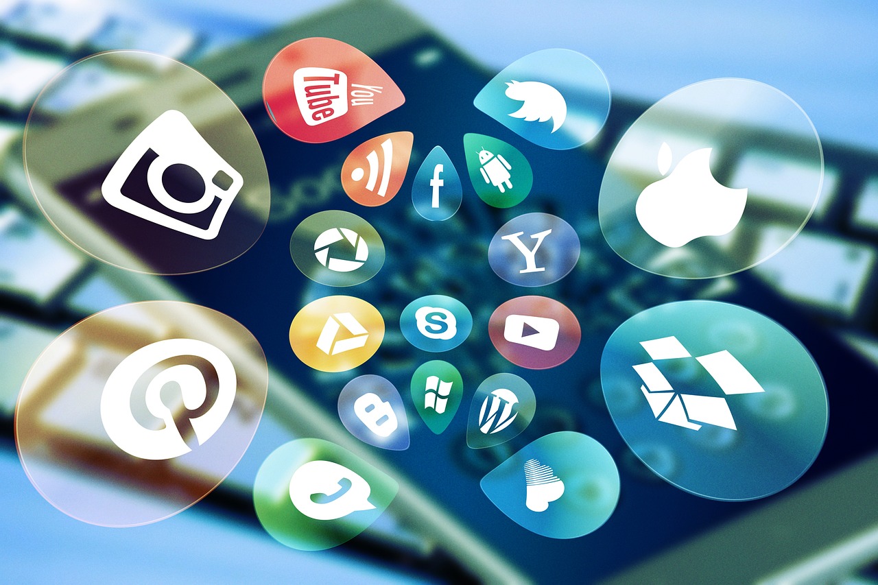
We live surrounded by tiny colored squares that fit in the palm of our hands yet open portals to all kinds of experiences, addictions, consumption, and connection. They are app icons, and their purpose goes far beyond convenience.

These symbols are designed to communicate silently. They combine psychology, design, marketing, and semiotics. They don’t simply represent an app; they call us to action. As Marshall McLuhan famously argued, every technology is an extension of the human body. Our fingers tap in response to visual signs that shape our behavior, often without our awareness.
“All media are extensions of some human faculty — psychic or physical.” — Marshall McLuhan, Understanding Media: The Extensions of Man
Icons Are Signs with Intentions
In semiotics, every sign consists of a signifier (its form) and a signified (the concept or meaning it conveys). An icon is a visual sign loaded with intention:
- Instagram uses vibrant gradients and a nostalgic camera design, reinforcing the idea that you’re capturing something “real,” authentic, and beautiful.
- WhatsApp combines a speech bubble with a telephone handset, bringing together the familiar act of making a phone call and the modern habit of sending quick messages.
- TikTok, with its pulsating musical note, immediately signals what to expect: fast-paced entertainment, rhythm, and instant gratification.
These images are designed to evoke emotions, activate emotional associations, and create a sense of belonging or urgency.
The Symbolism of Color
The colors used in app icons are also carefully selected:
- Red, as seen in YouTube’s branding, encourages action, grabs attention, and suggests urgency: “Click now.”
- Blue, as used by Facebook, conveys trust, authority, and familiarity — much like a digital institution woven into everyday life.
- Green, found in WhatsApp and Spotify, evokes movement, continuity, and an environment that feels active and alive.
These colors can influence our emotional responses and create specific associations, shaping how we approach an app even before we tap its icon.
Minimalism with a Purpose
Digital design has moved away from complex details and embraced clean, universal shapes. But this is about more than aesthetics. It’s a strategy.
Minimalism makes icons:
- Universally recognizable, without relying on text;
- Easier to remember;
- And, above all, instinctive.
The simpler the icon, the faster the association with its function. Less thinking, more clicking. It’s a symbolic language designed for immediate impact.
An Invisible (But Powerful) Language
The digital interface has evolved into a new language, and icons are its verbs, nouns, and punctuation marks. They organize our actions, direct our attention, establish patterns of use, and tell us what matters — and what doesn’t.
You’re not simply clicking. You’re reading a symbolic language designed to influence your behavior. And the less aware we are of it, the more we operate on autopilot, like well-trained machines.
The Icon as a Symbolic Command
Every icon carries a disguised instruction. A hidden invitation. A code that triggers behavior. By examining these symbols through the lens of semiotics, we become more aware of the symbolic game behind the aesthetics — and, in turn, less susceptible to manipulation, more critical, and more conscious.
Until the next click, or rather, until the next sign disguised as an app on your screen.